Q: What happens when you replace a brand’s key visual, like Toblerone’s iconic Matterhorn silhouette, with a generic version?
A: Once an implicit association has been established through consistent repetition over multiple decades and across UI touch-points, subtle evolutions in key visuals or even brand icons shouldn’t trigger significant impact UNLESS they they don’t turn out to be so subtle, semantically speaking.
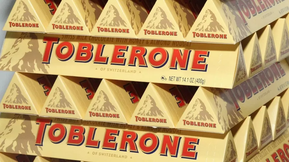
‘Toblerone is to remove the Matterhorn mountain peak from its packaging when some of the chocolate’s production is moved from Switzerland to Slovakia.
The pyramid-shaped bar, which mirrors the Alpine peak, will undergo a labelling revamp and include its founder’s signature, its maker said.
US firm Mondelez said the image of the 4,478m (14,692 ft) mountain will be replaced by a more generic summit.
Strict rules have applied about “Swissness” since 2017.
They state that national symbols are not allowed to be used to promote milk-based products that are not made exclusively in Switzerland. For other raw foodstuffs the threshold is at least 80%.

In a statement to the BBC, Mondelez said it was moving some production outside of the country to “respond to increased demand worldwide and to grow our Toblerone brand for the future”.
It said its new packaging would include a “distinctive new Toblerone typeface and logo that draw further inspiration from the Toblerone archives and the inclusion of our founder, Tobler’s, signature”.
Toblerone, the mountain-shaped chocolate made from Swiss milk with honey and almond nougat, first went on sale in 1908 in Bern, the capital city of Switzerland.
But it was not until 1970 that the Matterhorn’s jagged silhouette debuted on its packaging, with the Bernese bear and eagle featuring before then, according to the Toblerone website.
Mondelez said Bern was an “important part of our history and will continue to be so for the future”.
In 2016 Toblerone courted controversy by changing the design of the chocolate bar to space out the distinctive triangular chunks in a bid to keep down costs.
After much criticism the company reverted to the original shape two years later.’
Replacing the Matterhorn silhouette with a generic mountain peak version is likely to go unnoticed. Except for the most perceptive amongst our alpinist-chocolate connaisseur friends, a generic mountain peak icon flanked by the brand logo on top of the distinctive, yet familiar Toblerone packaging, shouldn’t trigger a revolution in and of itself. However, the back story that explains the rationale for the change, is a different story. A real brand story.
Access our Mindspeller insights platform and join us in monitoring the impact on Toblerone’ brand equity. We suspect that, even if this back story gets traction online, the phrase “there’s no such thing as bad publicity” applies. However, since the brand’s US owner, Mondelez, have interfered with the brand DNA more than once, it remains to be seen if the brand perception gets impacted on the semantic level.
The jury is out. Get the verdict via your Mindspeller account.